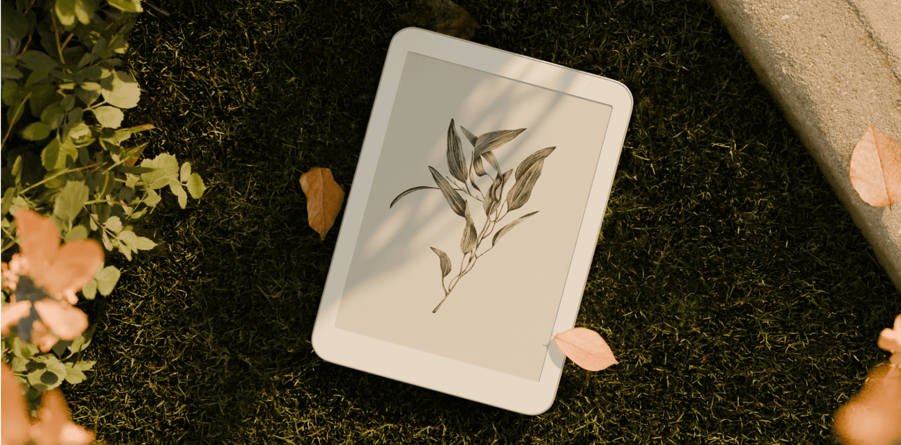
Daylight
The Daylight team has an ambitious view of how technology fits into our lives. They approached me to help with the design of an operating system that served as an antidote to how we use computers today. Together, we designed several key components of the OS, including the Onboarding, Home, App Management, Library, Reader, and Screen Time surfaces.
Boot up animation
It starts with a single circle, floating in the void. As the device hums to life, the circle begins to shift, expanding and contracting with purpose. The once humble shape now stands as the Daylight logo—a symbol of clarity and thoughtful design. It’s not just a boot-up sequence; it’s a reflection of the brand’s ethos, a seamless unfolding of something greater from something simple. It feels less like an animation and more like an arrival, setting the tone for what’s to come.
App selection
Imagine your device greeting you with a simple question: What do you want to do? This isn't about installing a slew of random apps. Instead, you're presented with intuitive, thoughtfully-organized categories based on actions. Each category offers a curated collection of apps designed to elevate those actions. This prototype moves beyond a traditional app selection screen, focusing on intent. Multiple designs are explored--some invite you to dive deep into personalization, while others streamline the process, making it as effortless as possible. It's a refreshing, action-first approach to onboarding that turns app selection into a moment of reflection, not routine.
Home explorations
We drew inspiration from stationery that layers papers of different sizes to create depth and invite exploration. We translated that idea into the software by using overlapping panels that naturally rested over each other to provide clear wayfinding and focus. Since the edges are where the device is held, placing interface elements within reach made interactions feel immediate and grounded in the hand. The UI emerges from the perimeter, allowing the center to remain focused on the primary task. I worked in low-fidelity visuals that emphasized structure, interaction, and flow over surface detail. This allowed us to evaluate how the interface felt to use, ensuring that reachability, hierarchy, and physical alignment with the device guided the experience from the start.
Web app
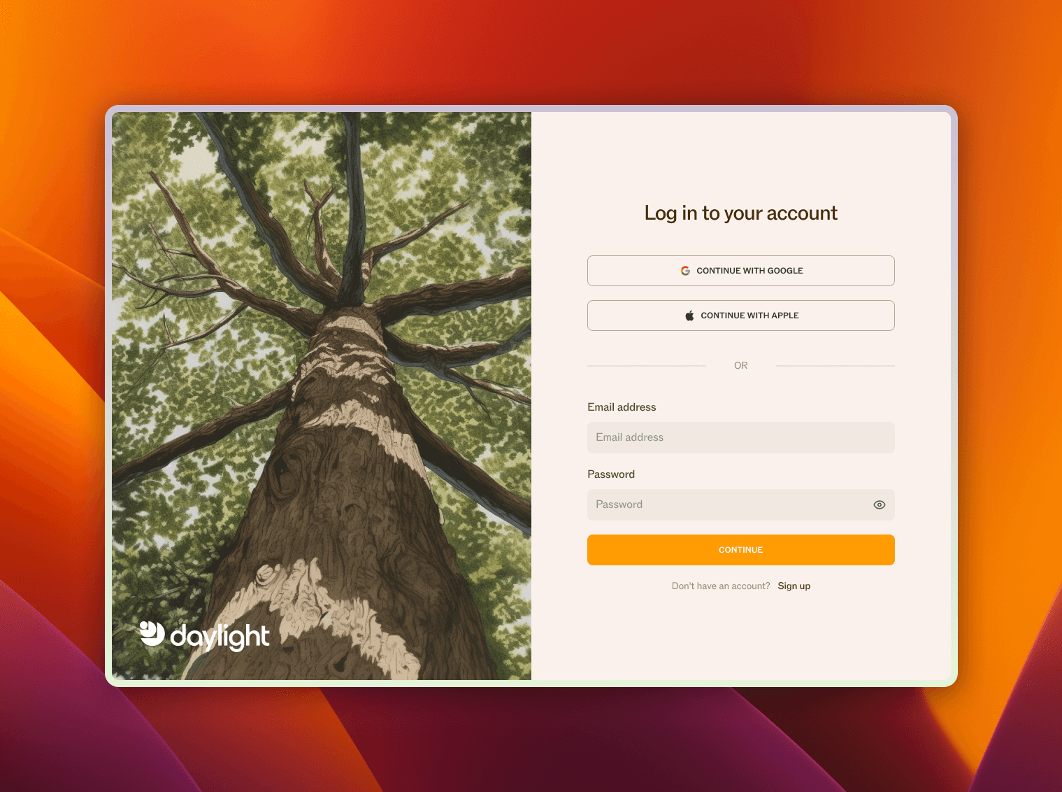
When we set out to design this web app, the goal was to create more than just a digital tool--it had to be a sanctuary. The user is invited into an interface that doesn't shout for attention but rather whispers, allowing them to engage at their own pace. On the login screen, a towering tree stretches toward the sky, reminding the user of growth, simplicity, and groundedness. To the right, minimalist login options extend a hand, asking users to step inside with ease--no clutter, just the essentials. The contrast between nature and technology subtly sets the tone from the very first interaction.
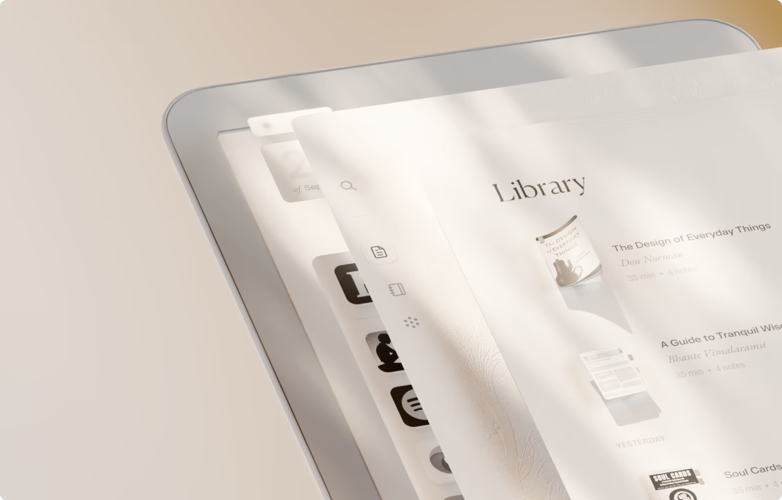
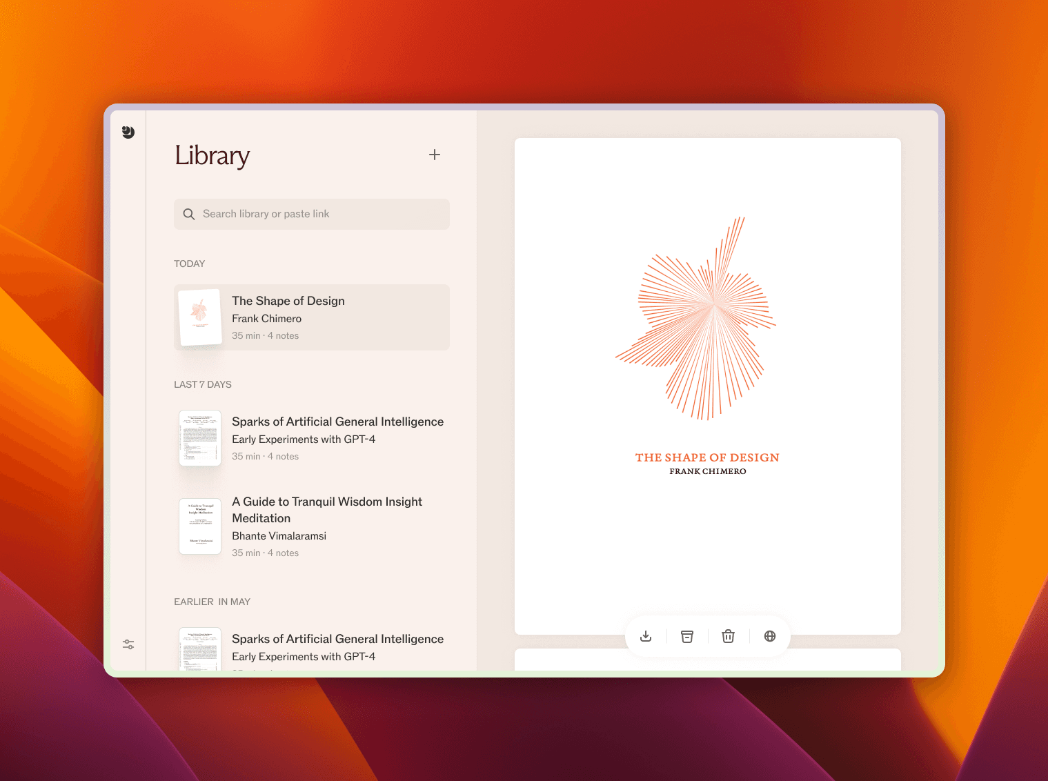
The library displays books and articles as cards. The layout is spacious and calming, offering users the ability to focus without distraction. Every element, from typography to icons, has been meticulously crafted to feel like an extension of the user's intent.
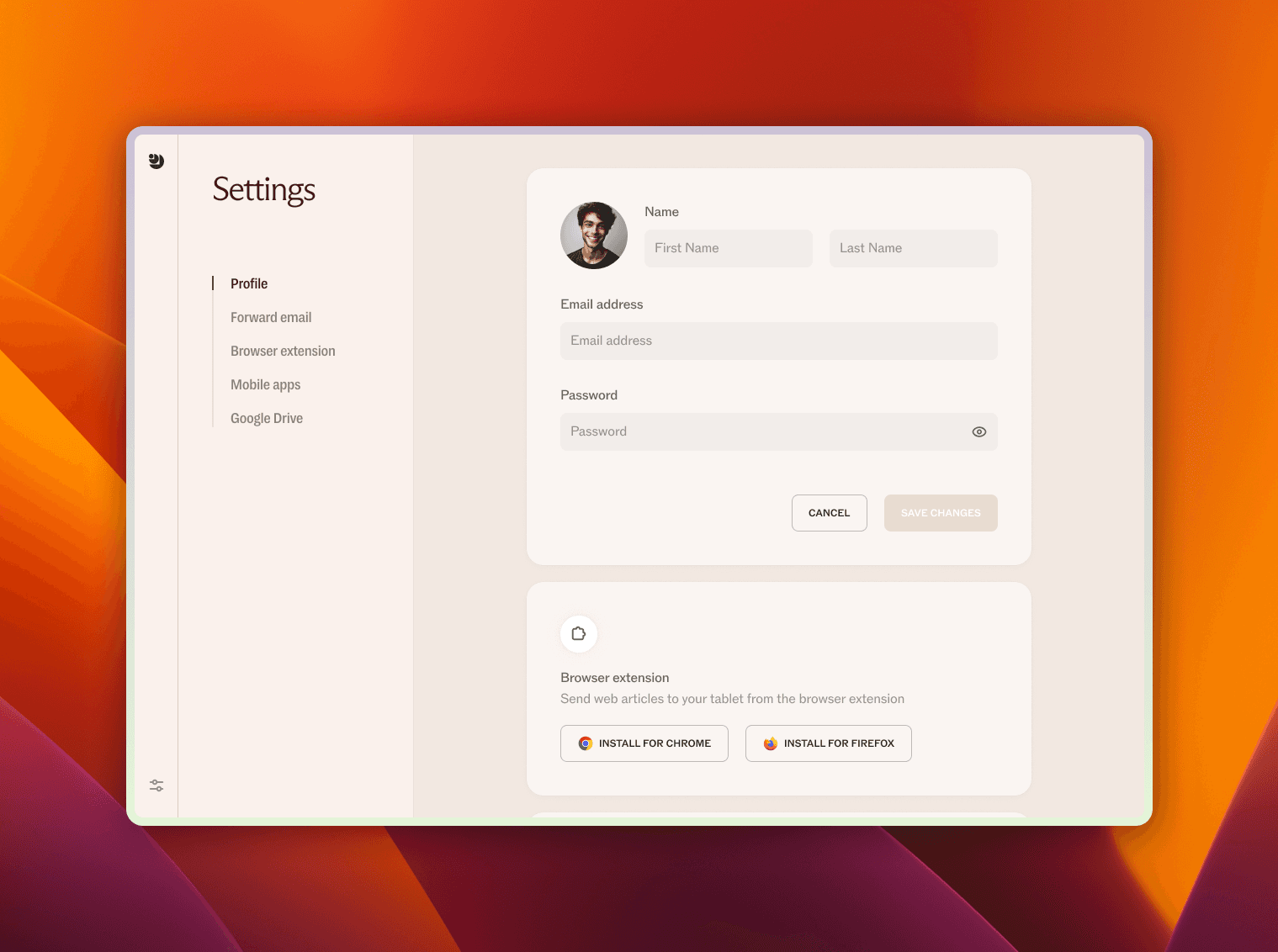
Settings are thoughtfully arranged, giving users control without overwhelming them. The navigation is seamless, whether you're tweaking your profile, syncing with cloud storage, or managing extensions. It's the kind of design that's there when you need it but fades away when you don't.
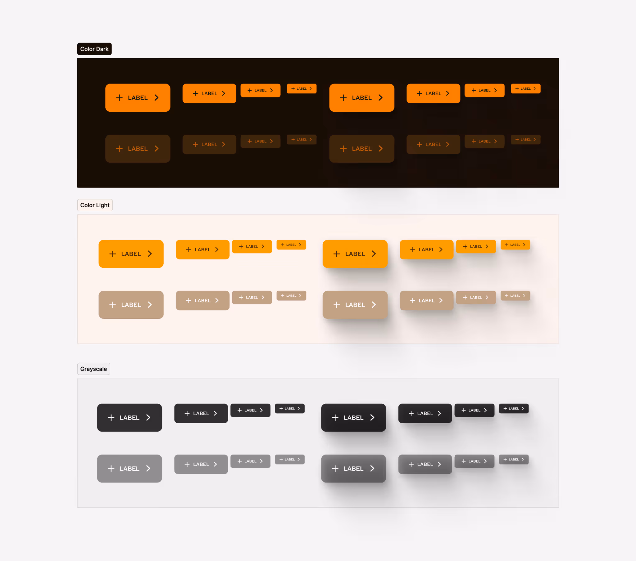
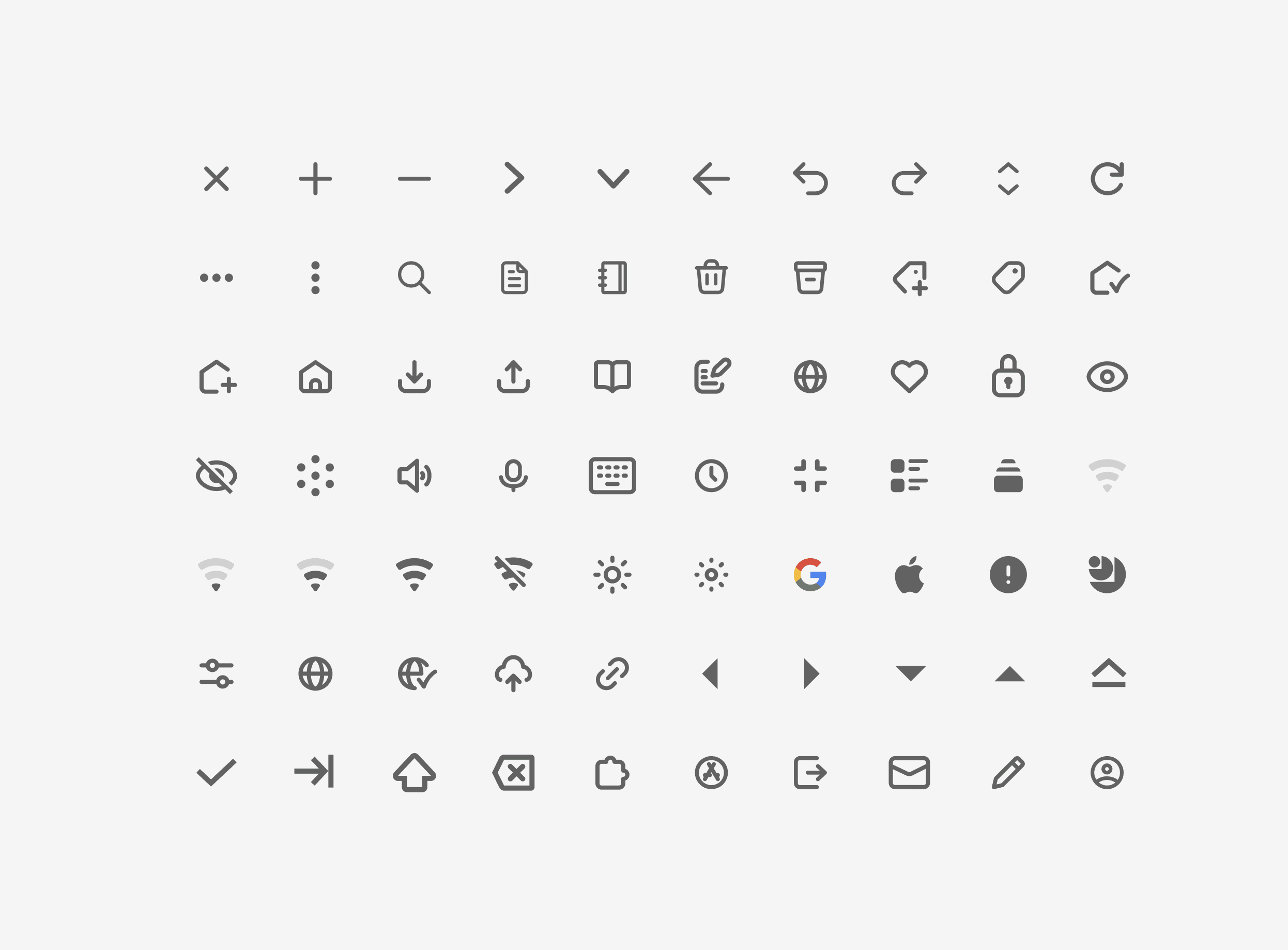
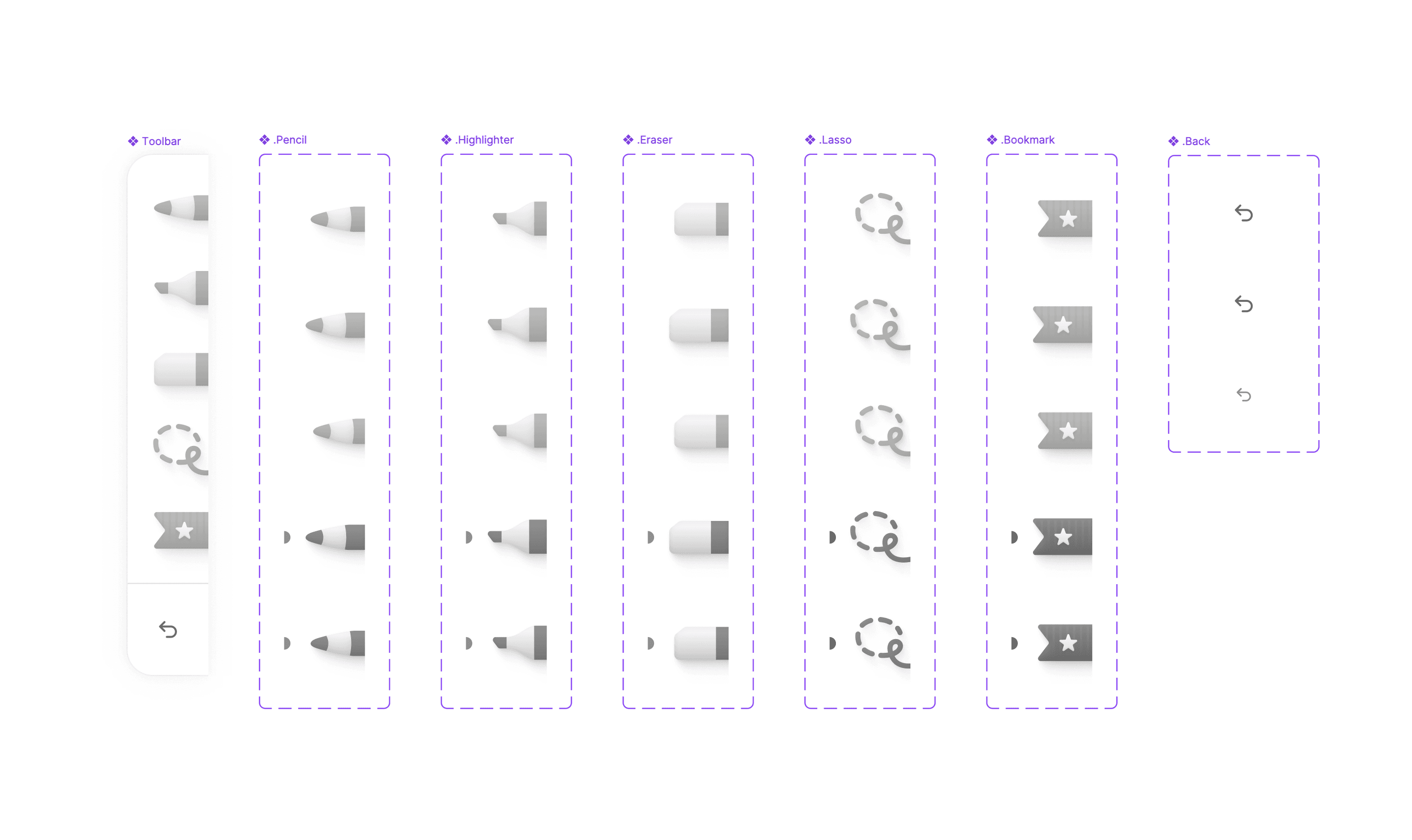
Design System
The Design System reflects a design philosophy where aesthetics serve functionality, creating an environment where users can navigate with ease and focus on what matters. At the heart of this design system lies versatility, with a color palette that adapts to three distinct modes: Grayscale, Amber Light, and Amber Dark. Every option is calibrated to deliver a cohesive experience regardless of the environment or user preference. The amber modes infuse the interface with warmth, while grayscale provides a more muted, neutral backdrop, ensuring accessibility and aesthetic harmony.