Tonic
Tonic combined machine learning and human editors to scour the web and find the most interesting articles to read everyday, curated just for you. We wanted Tonic to equip you to tell the best stories at a dinner party. The app learned from your activity and fine-tuned the recommendations as you go.
Services
Date
2019 - 2020
Onboarding
I designed the onboarding flow to use concise language and colorful imagery to convey a simple value prop. Instead of explaining the mechanics of how it works, I focused on the desired feeling we wanted to achieve by using our app.


How do we know what you'll like on your first try? Other apps will dump you in a flow where you'll choose categories and interests, but we found that to be grating. Instead, we showed users a sample of the content they could find behind the app and asked them to select five articles that they wanted to read by adding it to their bookmarks. This accomplished two goals: we introduced people to bookmarking, which is the main action they'd be performing when using Tonic and we avoided the ghost town problem and made sure users always had something to read, even on day one.

Mindful Consumption
Our goal was to give people a reason to come back to the app without relying on engagement mining and growth tactics. We decided to apply the old adage of using quality over quantity. So instead of doom-scrolling through an infinite feed of content, we'd bundle the best into five recommendations every day. This made the app feel fresh and gave you a reason to come back every day, without having to rely on growth hacks or annoying notifications.
Each bundle is uniquely tailored to you based on the app's knowledge of your interests. In each bundle there are 4 articles that we know you would love and a wild card: the best from a topic you may not typically be exposed to. That's how we delight and surprise people through our recommendations.


Information Architecture
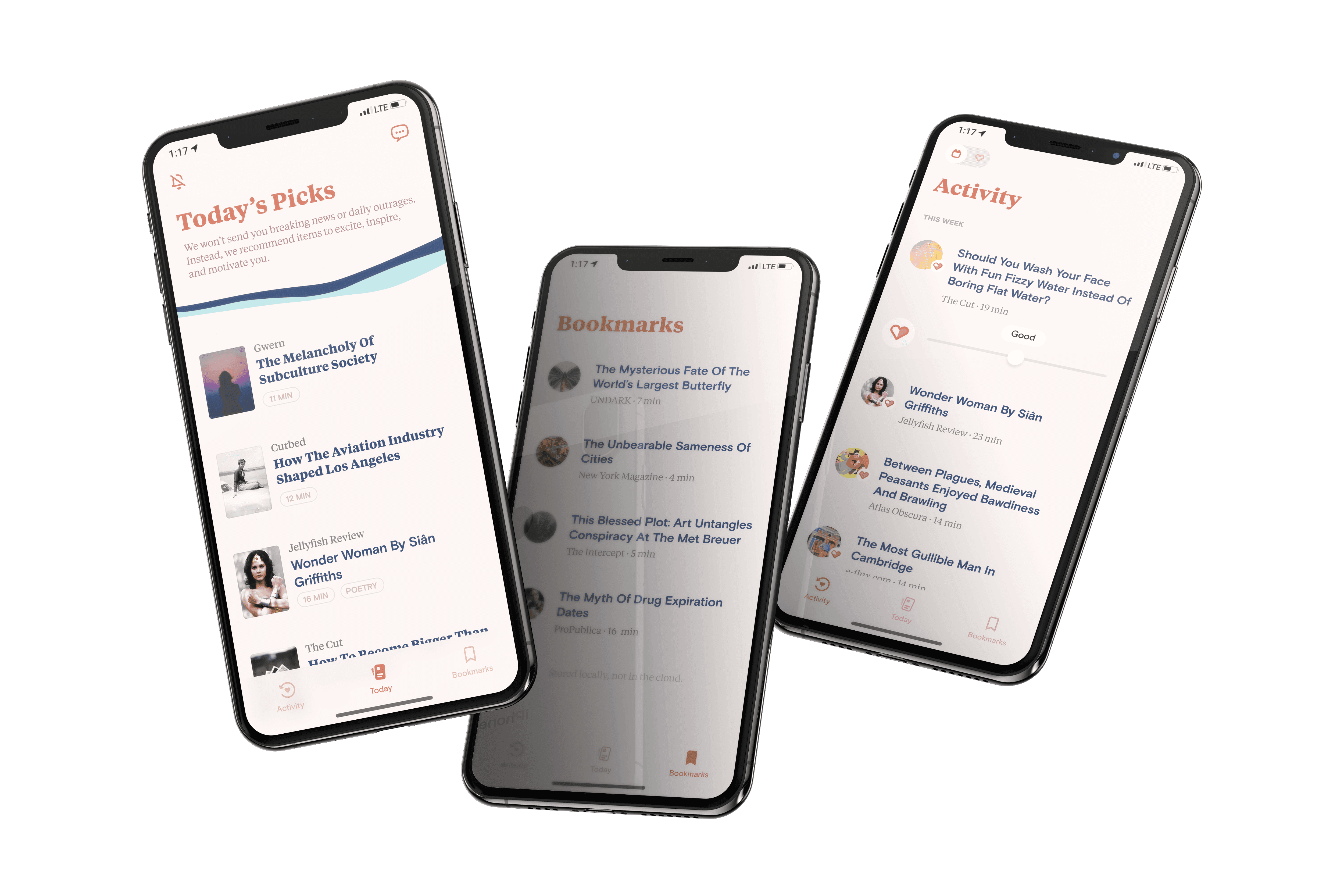
We wanted the app to feel simple and intuitive, so we designed the home experience to show everything you needed to see at a glance. Each recommendation is displayed as a beautiful card, where the content can shine and feel like something worthy of your time. After you read a recommendation, it moves away from your Recommended section and into the Last Opened section, so you can easily pick up where you left off. Below it, you can find the rest of the articles you've saved for later.


Feedback
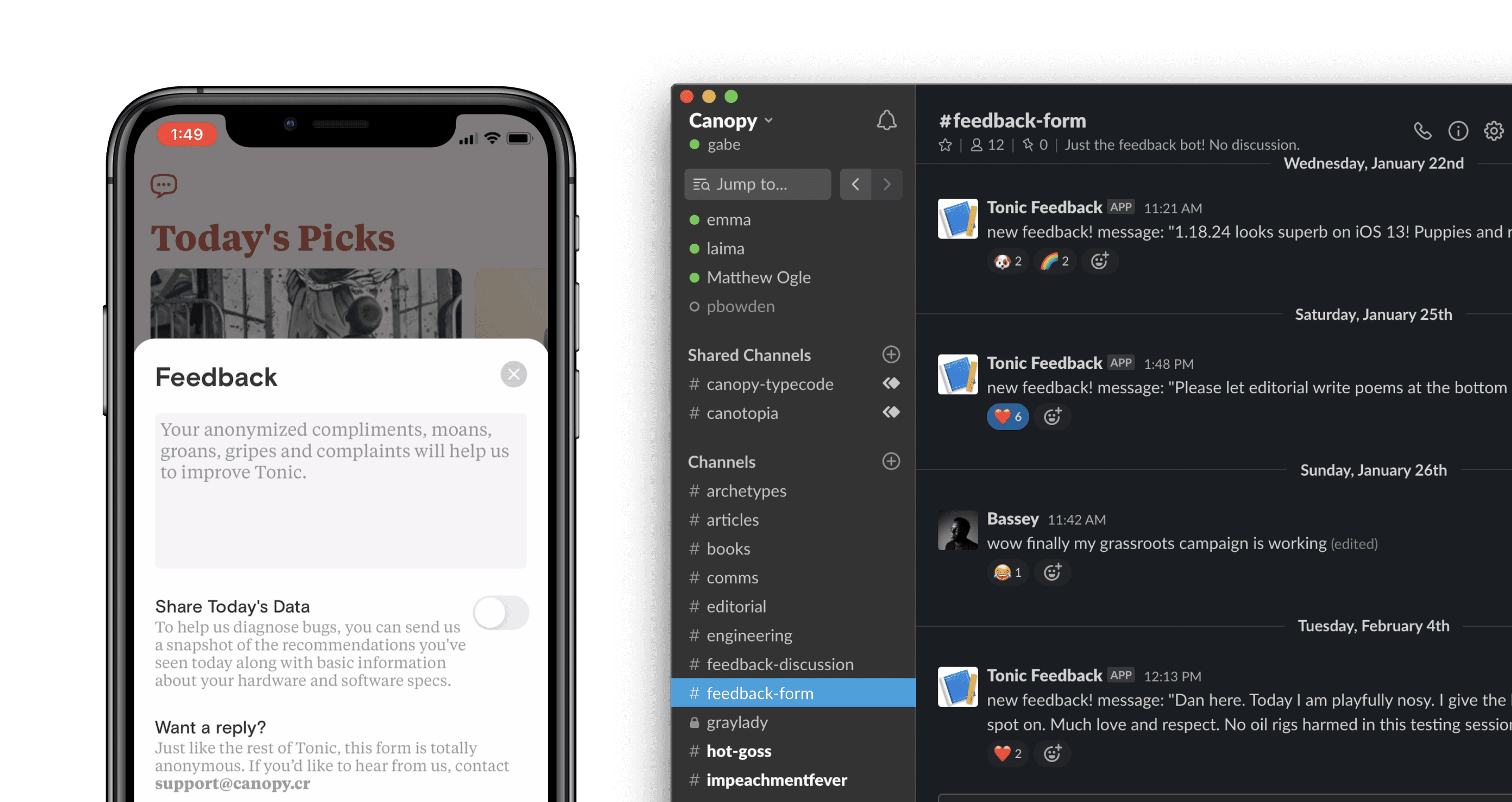
We put a feedback button in the main screen that, when tapped, it allows any user to send an anonymous message directly to our Slack channel. It's a wonderful window into our users' minds. We get messages every day from users who love and hate our app and most importantly WHY they do.
Transparency & Control
In the activity tab, we show a heart indicating how much we think you enjoyed every article you've read. At any point, you can correct that rating and teach the algorithm what you like by long pressing on the article and dragging your thumb to the rating. The heart then updates to reflect your desired rating. In the cases we got the recommendations entirely wrong, we encouraged people to swap their recommendations for a brand new one. In order to avoid variable rewards engagement hooks, we instated a limit of five swaps per day.
